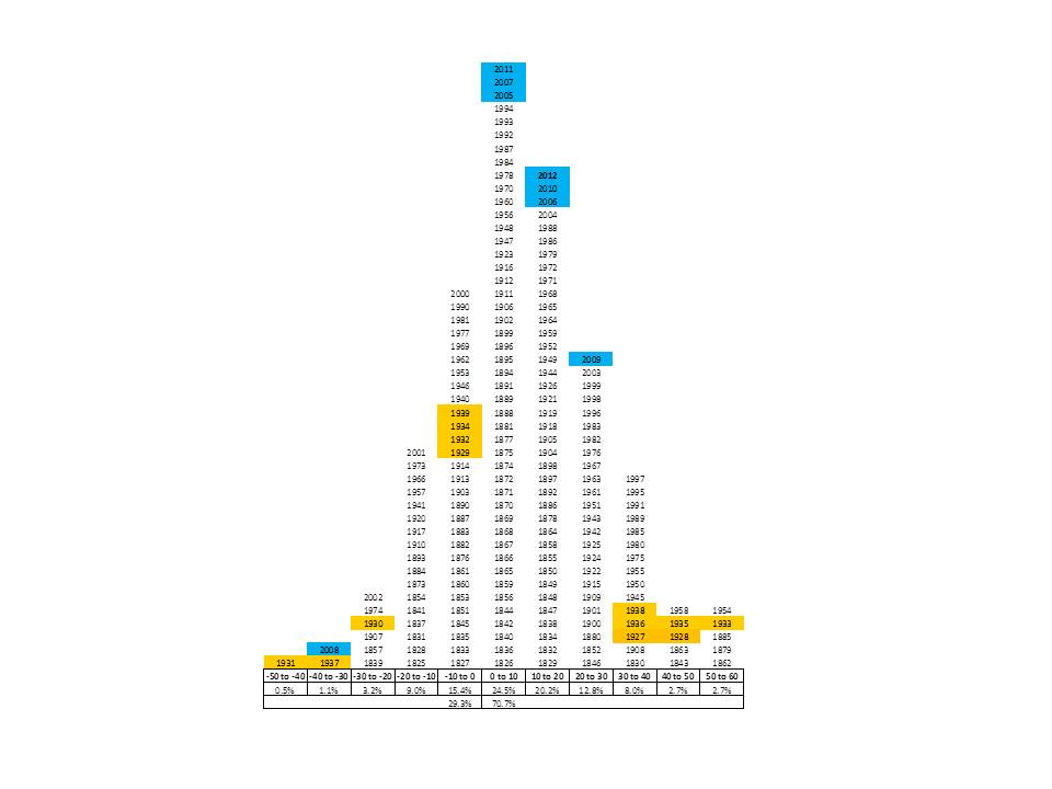
Better late than never. I have updated the equity market annual return histogram for the 16.00% total return generated by the S&P 500 index in 2012.
As Michael Mauboussin says, when understanding an investment idea, we should try take an outsider’s big-picture view in addition to our own expert view of the minutiae of the idea. I first came across the equity market return histogram a few years ago and I believe it offers perspective on the feasibility of return expectations.
The ranges at the bottom are the ranges of returns for each annual period. The years highlighted in blue are the years involving the recent Great Recession and those in orange involve the Great Depression. As you can see, there were many more outliers during the Great Depression. The Gr eat Recession looks rather normal in comparison.
My opinion of expected returns is based on data obtained in the Graham-Shiller CAPE index and from Tobin’s Q ratio (plus several other metrics), so I expect low, single-digit equity market returns over the next eight- to ten-years. The CAPE, which measures long-term Price/Earnings ratios, and the Q, which measures Price/Replacement-Cost ratios for the market, are 39.1% and 40.6% higher, respectively, than their long-term averages.
But, if we believe past is prologue, then there is a 75.5% chance that returns this year will fall outside of the range of 0% to +10%. I believe I am rationally pessimistic for the near term (but a long-term rational optimist), but historically there is only a 13.9% chance that an investor will lose more than 10% of their capital in any year in the market. This kind of outsider’s perspective helps me temper my pessimism, but the best way to temper it is to invest with a MARGIN OF SAFETY. Unfortunately, few investments offer a Margin of Safety these days.
